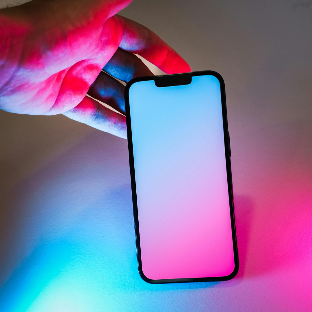
Let’s be real—everyone loves scrolling at night without feeling like their eyes are getting fried. That’s where dark mode comes in, and it’s not just a trend—it’s a game-changer for your app.
Why Dark Mode Rocks:
- Easy on the eyes 🌃
- Low-light environments can strain eyes. Dark mode gives users a chill, comfortable experience. Perfect for late-night scrolling, reading, or gaming sessions.
- Battery saver 🔋
- On OLED screens, dark pixels use less power. That means longer battery life for users—your app = more love points.
- Feels modern & personal 💖
- Users love choice. A dark/light toggle shows you care about their preference and makes your app feel sleek, customizable, and fresh.
- Enhances content focus 🎯
- Dark backgrounds make images, icons, and text pop, helping users focus on the key stuff without distractions.
Pro Tips for Dark Mode:
- Keep contrast balanced—too dark = hard to read, too light = defeats purpose.
- Don’t just invert colors; adjust UI elements like buttons, icons, and backgrounds for clarity.
- Let users toggle anytime—flexibility = engagement.
Conclusion:
Dark mode isn’t just “cool.” It’s functional, stylish, and user-friendly. Offering it shows users you care about their experience—and that’s how you keep them coming back.
Disclaimer:
The tips shared in this blog are for informational and educational purposes only. Every app project is unique, and what works best may vary depending on your industry, audience, and business goals. For specific solutions, consult a professional UI/UX designer or development team.
Leave a Reply